New
Telegram · Categories
Fonts
Browse stickers, emoji and bots by topic.
Page 1 of 4
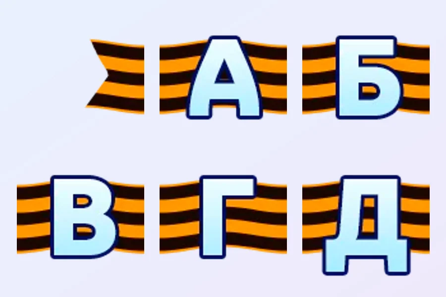
New
Font
New
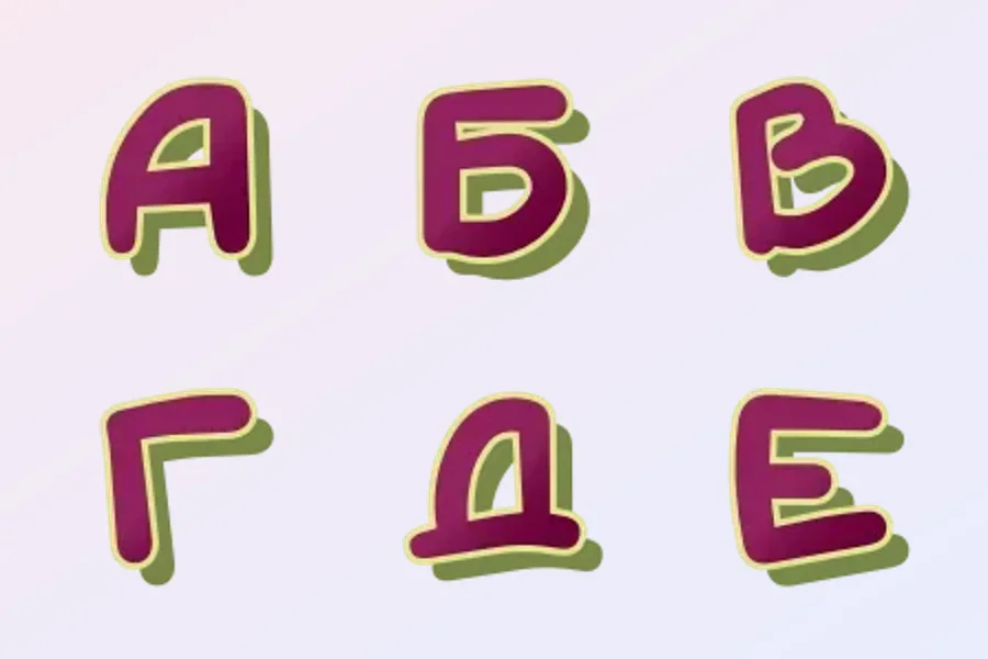
Font
New
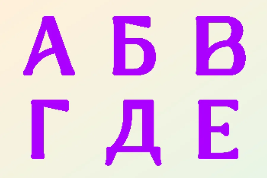
Font
New
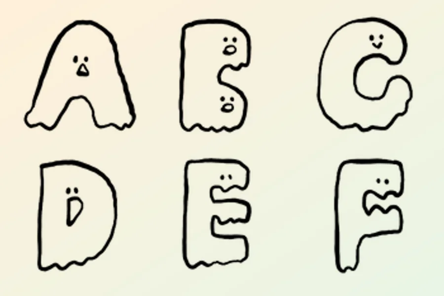
Ghost Letter
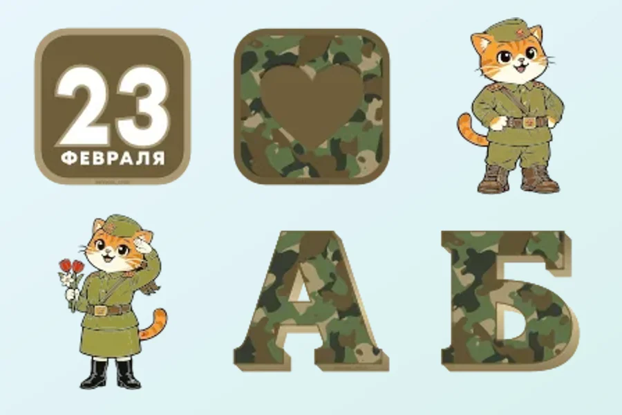
23 February Font
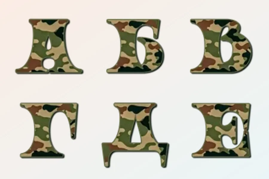
23 February Font
23 February Font
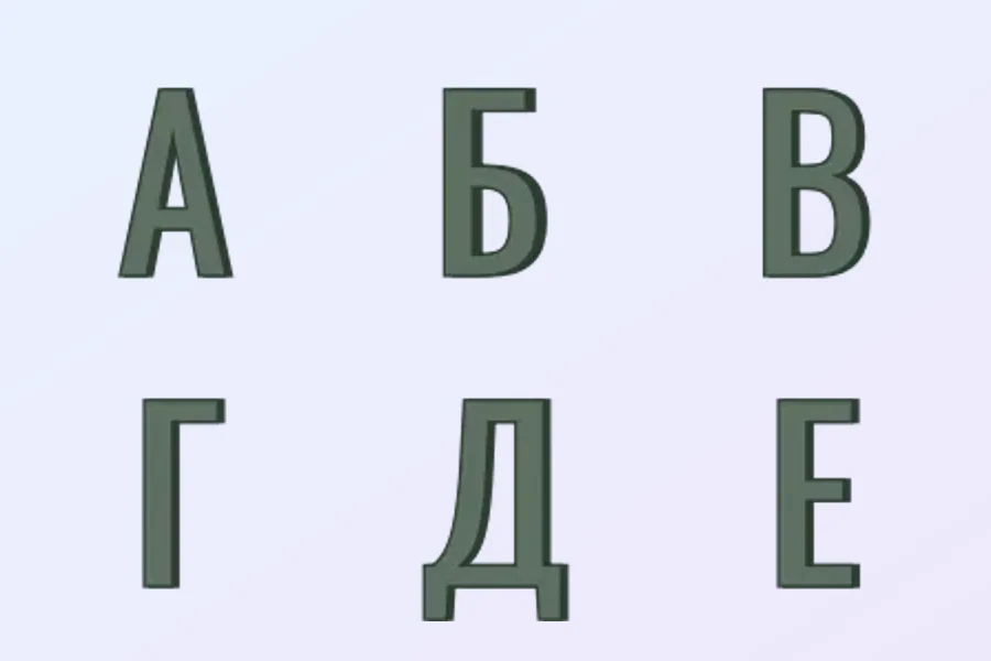
23 February Font
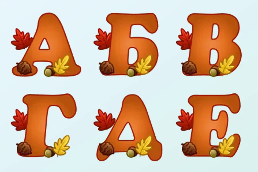
Autumn font
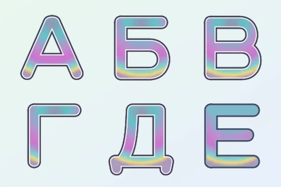
Iridisc Font
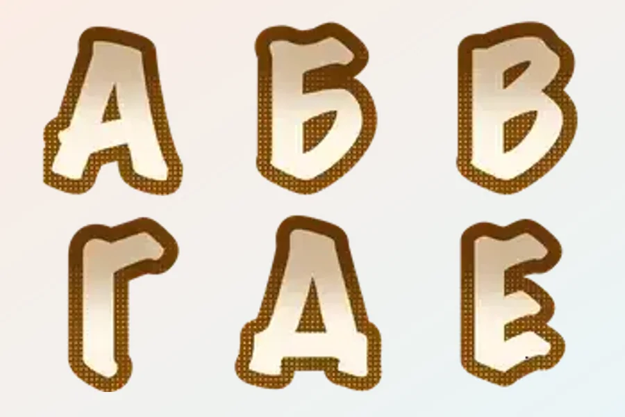
Font
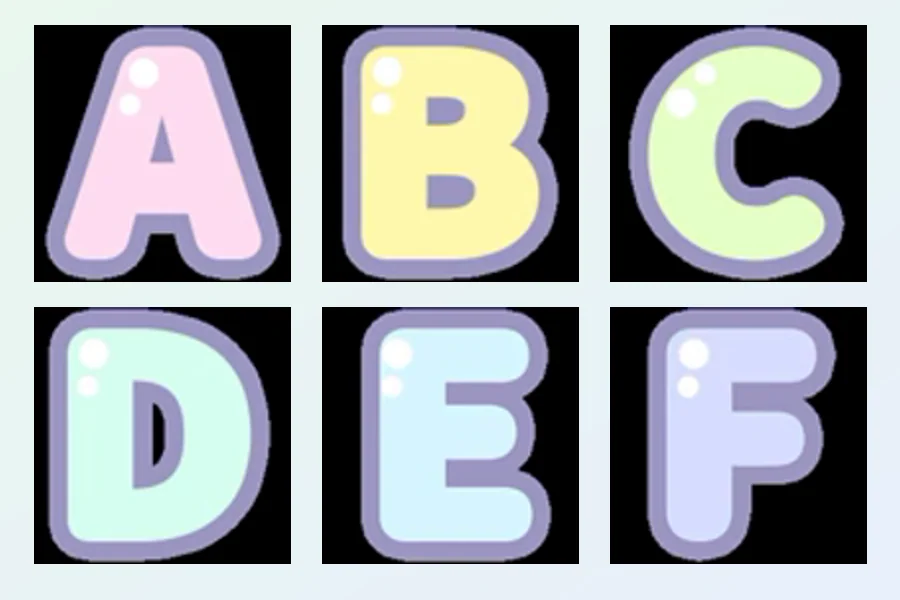
Pastel font
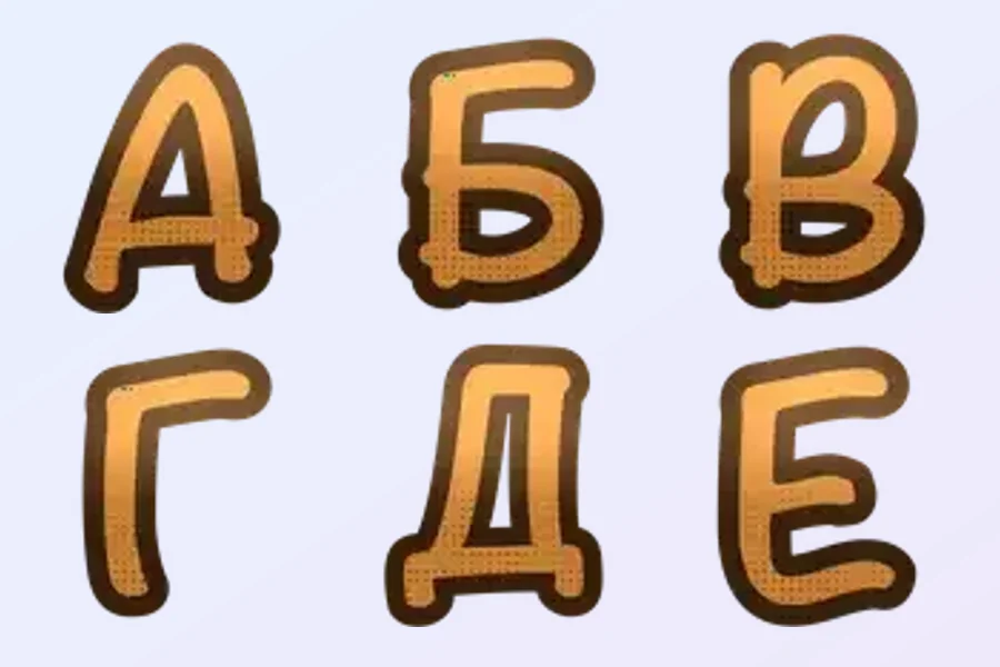
Font
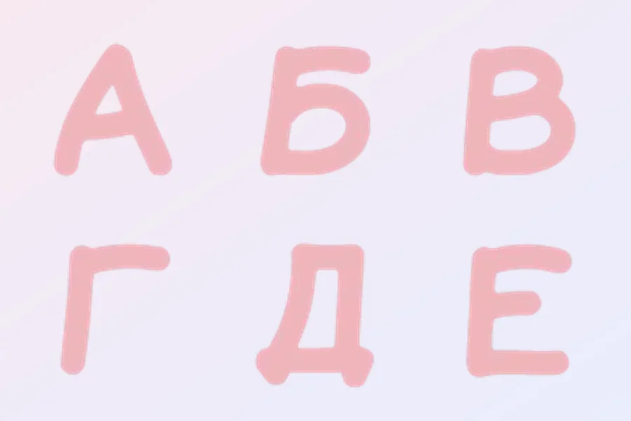
Pink font
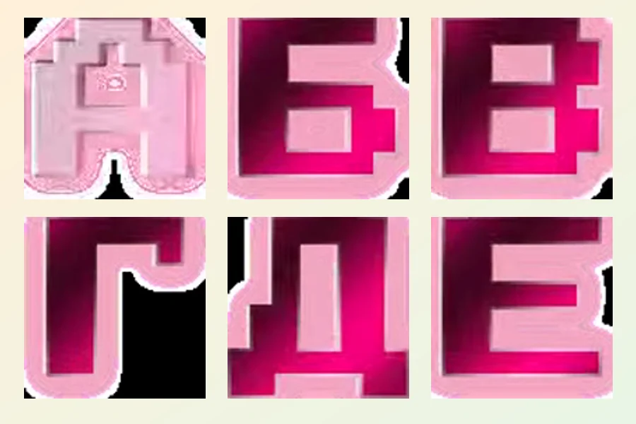
Font
Font
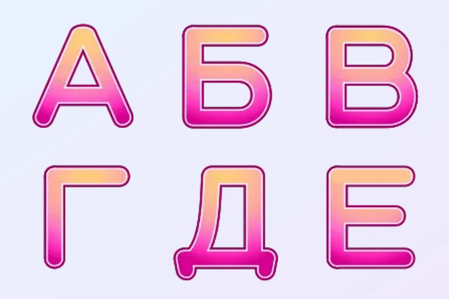
Dawn Font
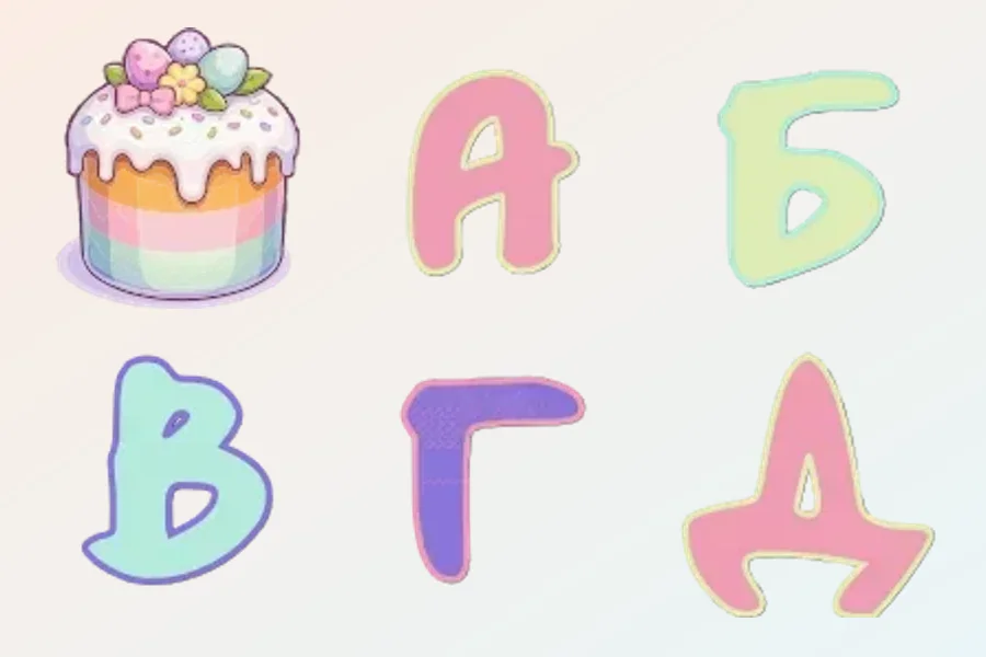
Easter HD font
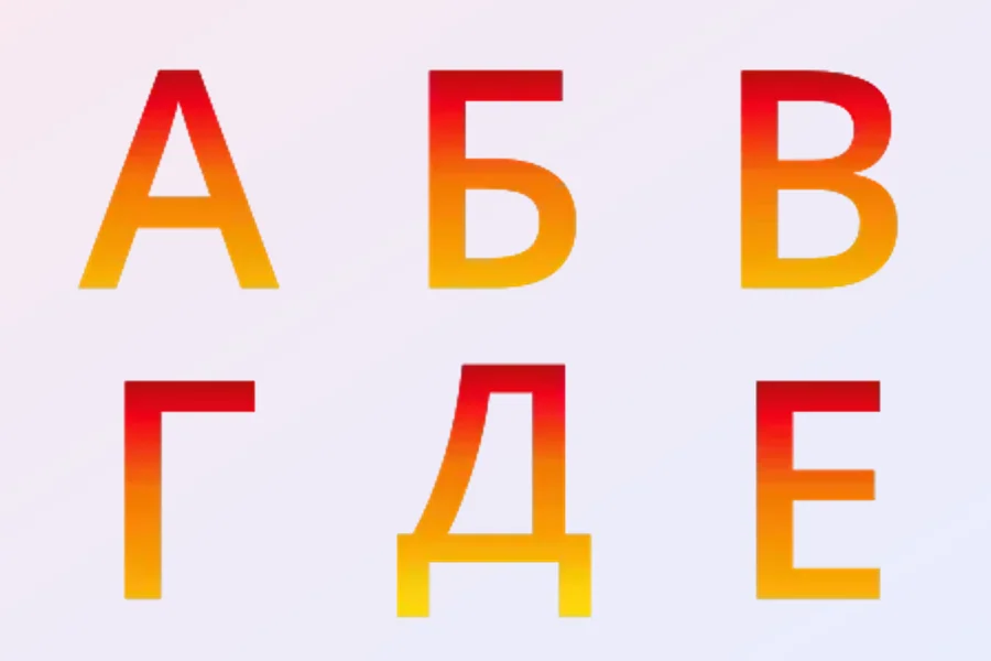
Autumn font
Graphic fonts: compare letterforms and character coverage
Here, a font means a set of graphic letters for distinctive short pieces of text. Its character comes from letter shapes, stroke weight, colour and decoration. Compare formal, rounded, handwritten or festive designs through the appearance of a whole word. An attractive individual symbol is only a starting point; the letters also need to form a clear and balanced heading together.
Check character coverage in the preview before choosing. Decide whether you need Latin, Cyrillic or both, then look for the required case, numerals and punctuation. Pay particular attention to less common letters in your phrase, similar looking signs and the spacing between elements. When a label mixes languages, a few familiar shapes do not establish that every necessary character is included.
For compact text, prioritise contrast, open counters and distinct letterforms. Volume, highlights and patterns can decorate a large letter while making a short word harder to read in a line. Compare several adjacent signs for consistent height and visual weight, and check that full stops and commas remain noticeable. Let the intended wording guide how much decoration is useful for your particular message.