New
Telegram · Categories
Cyrillic Alphabet
Browse stickers, emoji and bots by topic.
Page 1 of 3

New
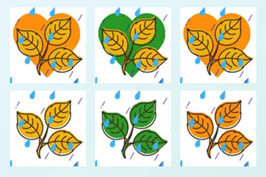
Autumn font
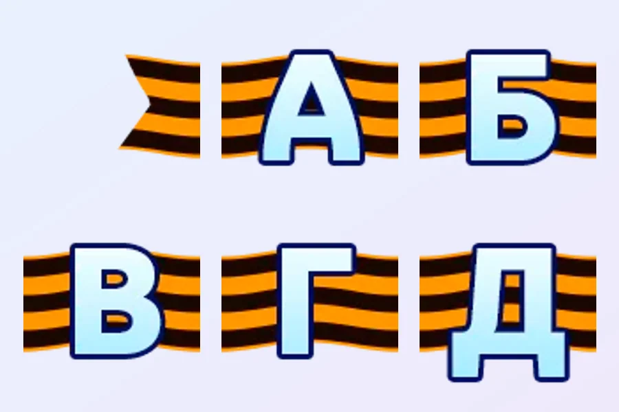
Georgievskaya lenta Font
Font
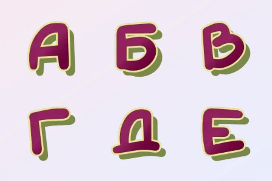
Font
Font
23 February Font
23 February Font
23 February Font
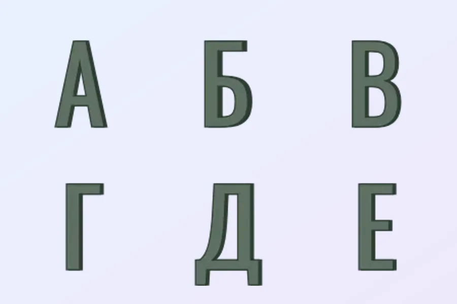
23 February Font
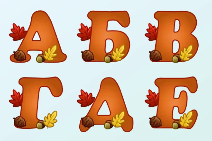
Autumn font
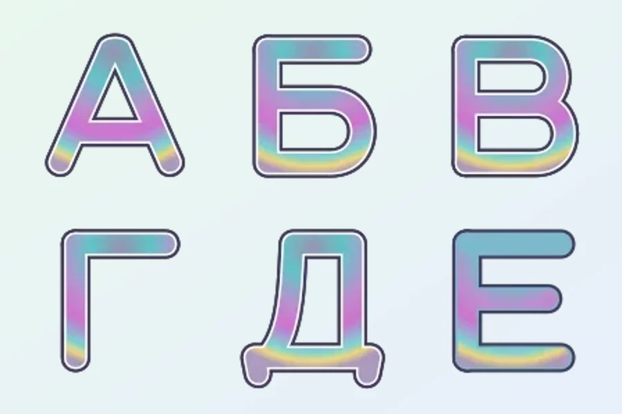
Iridisc Font
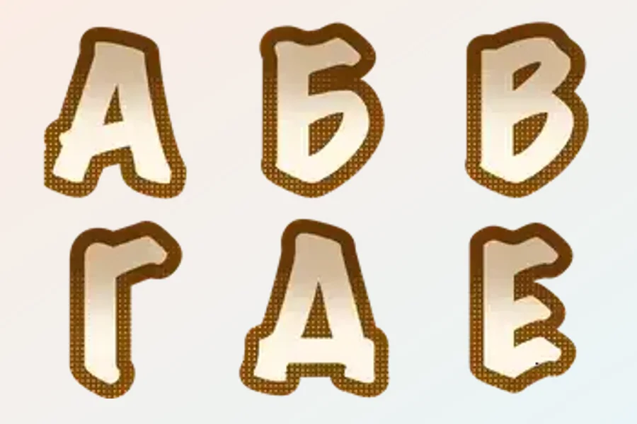
Font
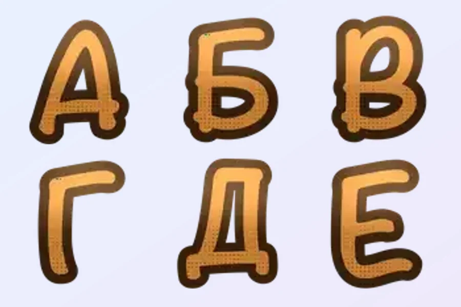
Font
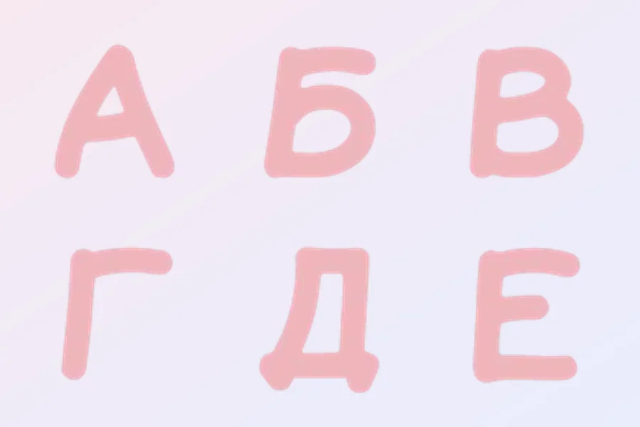
Pink font
Font

Font
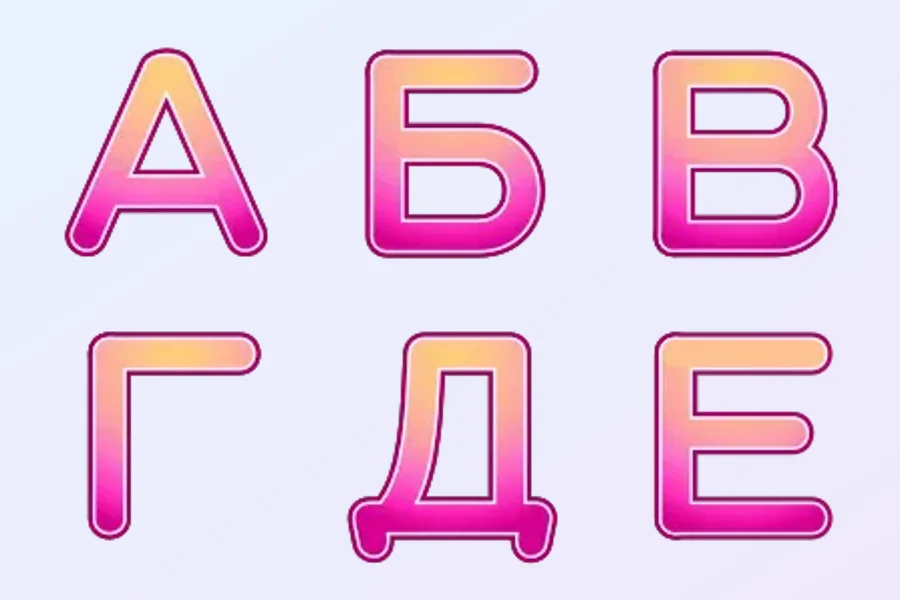
Dawn Font
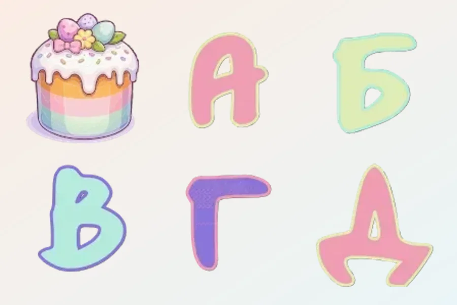
Easter HD font
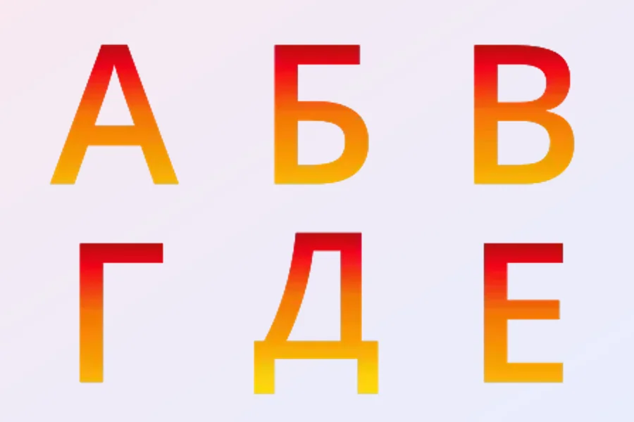
Autumn font
Cyrillic graphic alphabets with clear and balanced forms
Choose graphic Cyrillic letters through the way they form a word. The proportions of broad characters, the shape of curves and the weight of strokes affect its rhythm as much as colour does. This theme helps you compare restrained and decorative options for short headings, names and accents, while keeping the wording understandable at first glance.
Start with coverage in the preview: check the required upper and lower case, Ё and every other letter in your phrase, along with numbers, quotation marks and punctuation. For a language that uses additional Cyrillic characters, look for those specific signs. Similar looking Latin letters do not replace this check, and a few Cyrillic elements do not establish coverage of a complete alphabet.
Compare adjacent letters for height, spacing and visual weight. In a compact emoji, internal spaces should stay open, while thin tails and dots should remain visible among decorative patterns. A longer word is useful for spotting uneven widths and excessive ornament. A brief expressive accent can support a more elaborate texture, provided the actual lettering still reads clearly and the punctuation is easy to distinguish.